Who needs it?
This article intends to be a fast paced guide for anyone who is interested in undertaking a UI interview and needs a refresh on the technicalities, or for anyone who wants a fast jumpstart into CSS.
This article will serve you if:
- You’re getting ready for a UI interview
- You’re a student and want to get some concepts to study for later on
- You’re a professional and need an fast reminder, without re-reading w3schools
What is CSS?
Created by World Wide Web Consortium (W3C), CSS stands for Cascading Style Sheets, and describes how HTML elements are to be displayed on screen, paper, or in other media.
While HTML was created to describe the content of a web page, CSS describes the styles for the HTML contents of the web page.
How to use it?
Importing it
There are 3 ways in which CSS can be used inside HTML
Inline style (directly in the HTML element)
CSS can be directly applied to elements, by using the style attribute
<h1 style="color:blue;margin-left:30px;">This is a heading</h1>
Internal style sheet (using the <style> tag)
You can embed
<style>
body {
    background-color: red;
}
</style>
External style sheet (imported in the HTML document)
Practically this suggests that the styles be externalized to a .css file,
which is the cleanest way to handle css when having a lot of different UI components.
<head>
   <link rel="stylesheet" type="text/css" href="mystyle.css">
</head>
Cascading order
Generally speaking we can say that all the styles will „cascade” into a new „virtual” style sheet based on a strict order of overriding. The order in which styles override each other is:
- Inline style (inside an HTML element)
- External and internal style sheets (in the head section)
- Browser default
So, an inline style (inside a specific HTML element) has the highest priority, which means that it will override a style defined inside the <head> tag, or in an external style sheet, or a browser default value.
General CSS Syntax
A CSS rule-set consists of a selector and a declaration block.

The selector selects a specific elements from the HTML document.
The declaration block allows you to add properties to selector selected elements.
Selector
A selector is practically a pattern that is used in order to select an element from HTML
There are multiple ways to select elements using selectors. For a complete list please refer to the w3schools website.
By element
This style is used for selecting elements based on they’re HTML definition.
When using multiple element selectors, you practically perform an in depth selection of elements.
Ex.
 p {} // select all paragraphs
div p{} // selects all paragraphs inside all of the divs
By attributes
Since CSS is supports the selection of HTML elements, it makes sense to also select
HTML elements based on their attributes.
a[target]{
 // This will select all of the a elements that have the target attribute
}
a[target="https://abac.software"]{
// This will select all the as that point to our site
}
a[target="smth"][href="https://abac.software"]{
 // This will select elements based on multiple attributes
}
By id
Since HTML elements can have unique identifiers defines by using the id attribute,
CSS supports a means of selecting identifiers.
<div id="someId"></div>
#someId {
// # is the id selector which selects the div by id (hopefully just one element)
}
By class
Classes are generally used in CSS with you want a style to be applied to multiple
elements. It makes sense in the context in which multiple elements are „of the same class” (I think it’s inspired from object oriented programming).
.someClass {
       // . Is the class level selector which selects all elements having someClass
}
Grouping selectors
For performing multiple selections at once, CSS selectors can be grouped.
p, #myP, .my-ps {
 // Selects all the ps and the element withId myP and all the elements with the my-ps class
}
Pseudo classes
Pseudo classes allow for the selection of specific states of HTML elements. Let’s say for example that you want a div to change it’s background-color only when you hover your mouse over it, then the :hover pseudo class will allow you to style this.
.myDiv:hover {
    // :hover is a pseudo-class that selects the myDiv classed elements only when a mouse hover is performed
}
Declaration block
The declaration block ads styles to elements that are selected by selectors.
div {
 background-color:red; // properties are inserted here
}
The full list of available CSS properties can be found here.
Box model
What it is
All HTML elements can be considered as boxes. The CSS box model is essentially a box that wraps around every HTML element. It consists of: margins, borders, padding, and the actual content.
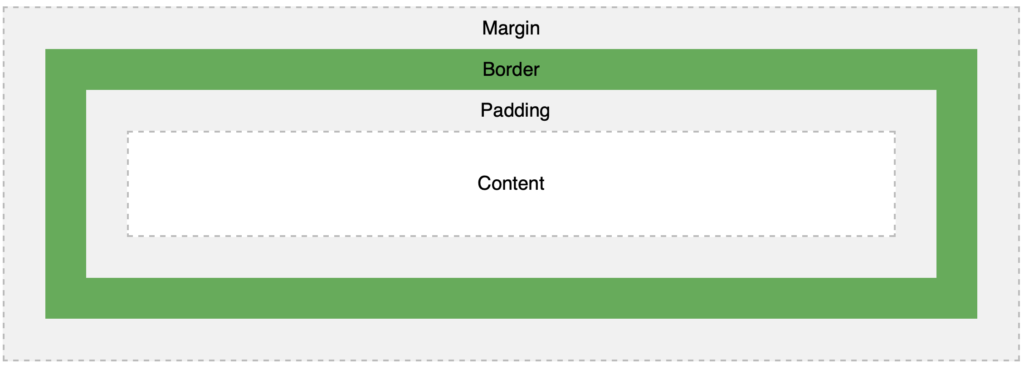
Explanation of the different parts:
- Content – The content of the box, where text and images appear
- Padding – Clears an area around the content. The padding is transparent
- Border – A border that goes around the padding and content
- Margin – Clears an area outside the border. The margin is transparent
Total element width = width + left padding + right padding + left border + right border + left margin + right margin
Block vs Inline
Block Elements
<div style="border:1px solid green;">
 This <div> element is a block level element
</div>

A block-level element always starts on a new line and takes up the full width available (stretches out to the left and right as far as it can). Examples:
<div>

<h1> - <h6>

<p>

<form>

<header>

<footer>

<section>
Inline elements
<p> This is <span style="border:1px solid green;">an inline <span> element inside></span> a paragraph</p>

An inline element does not start on a new line and only takes up as much width as necessary. Examples:
- <span>
- <a>
- <img>
- <button>
The display property
The display property specifies the display behavior (the type of rendering box) of an element.
//The most common display values:
p.ex1 {display: none;} // Hides the element from the dom
p.ex2 {display: inline;} // Treats the element as an inline element. width/height properties will be ignored.
p.ex3 {display: block;} // Treats the element as a block element
p.ex4 {display: inline-block;} // Treats the element as an inline element, but does not ignore width and height.
The position property
The position property specifies the type of positioning method used for an element.
There are five different position values:
| Static | default value |
| Relative | Relative to the default position. Takes top/left/right/bottom into account |
| Fixed | Relative to the viewport. It stays in the same place, even if it’s scrolled. Positioned using top/left/right/bottom |
| Absolute | Positioned relatively to the nearest ancestor that has the position property different than static.However; if an absolute positioned element has no positioned ancestors, it uses the document body, and moves along with page scrolling |
| Sticky | An element with position: sticky; is positioned based on the user’s scroll position.A sticky element toggles between relative and fixed, depending on the scroll position. It is positioned relative until a given offset position is met in the viewport – then it „sticks” in place (like position:fixed). |
PX, Pt, REM, EM & %
Pixels are pixels and we love them as such
Pt are points which are a common way of expressing distance in typography
REM are a way of setting font-sizes that are calculated based on the font size that is set on the <html> element.
Setting the html font size to 10 px, will mean that:
1.6rem = 1.6 * htmlFontSize = 1.6 * 10 = 16px
EM are relative to the font-size of the element (2em means 2 times the size of the current font)
The % operator allows you to set variable sizing based on the dimensions of the closest parent element
As a rule of thumb:
- Use Px when you have to define components having strict dimensions
- Use Pt when you application should support „what you see is what you get” printing capabilities
- Use REM when you have to define content that can be zoomed in or out, so that the fonts can auto readjust
- Use EM whenever you feel like it
- Use % operator when you have to create proportional content that splits up the screen
Layout
Historical perspective
In the early days of the web, creating content rich websites that would look good was not a trivial task. This had to do a lot with the layouting technology that was used in order to style the documents.
- HTML Tables –> This was the first solution for dictating layout in the early days of the web.
- CSS 1 & CSS 2 –> This brought concepts such as the CSS box model and floats which helped a lot with layouting. But because of the browser support issues, developers would still be using HTML tables for layouting.
- CSS3 introduced Flexbox.
Styling was performed using:
- Block
- Inline
- Table
- Positioning
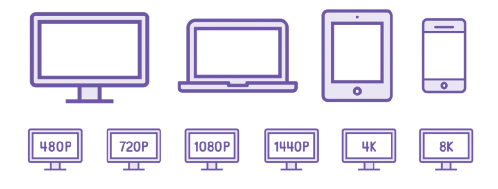
The problem was that any html document had too many resolutions to support!
Holy Grail layout
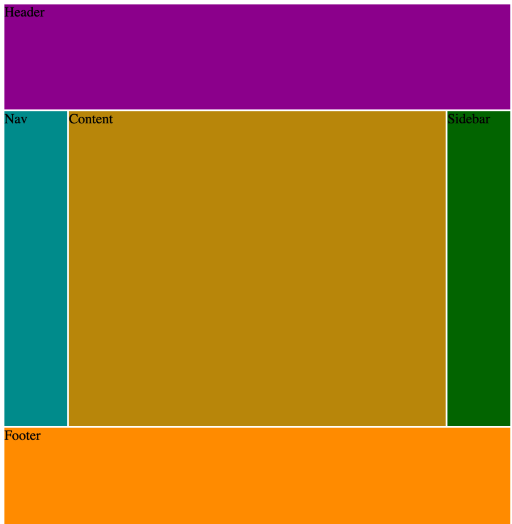
During the .com bubble, sites tended to have a very similar layout need. Even nowadays, a lot of websites use the Holy Grail layout as a backbone for structuring the user interface.
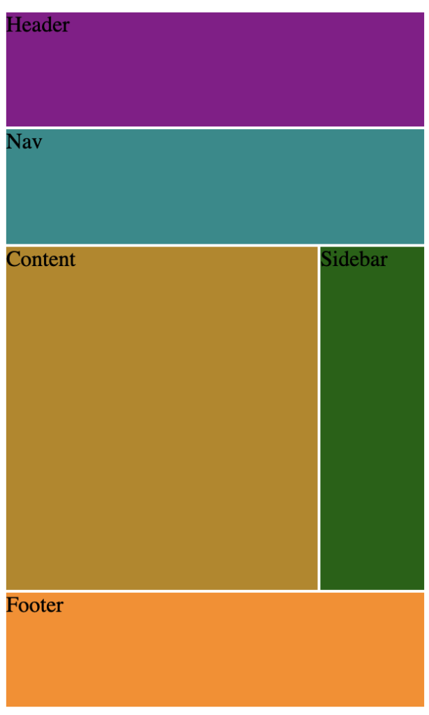
The components of the holy grail layout are:
- Header: The top area, usually used for navigation
- Nav: A lefthand area, for sites with lefthand navs
- Content: The area that houses the main content of the site
- Sidebar: The righthand area that can be used to host ads for example
- Footer: The bottom area
The holy grail layout looks as follows:

Back in the day, this layout would cause a bit of pain when it had to be implemented using tables and floats. Furthermore, the things got ugly when you wanted to have one representation of the holy grail for websites, and a complete different representation for mobile devices:
Thanks to layouting technologies such as CSS Flexbox and CSS Grid, the challenge of layouting has been reduced to a few lines of code.
Flexbox
What it is
The first draft version of flexbox was published in 2009. Flexible Box Layout Module was introduced because it makes it easier to design flexible responsive layout structure without using float or positioning. Flexbox is all about the relationship between a container element named a flex container , and it’s direct descendants elements called flex items.

Inside a flex containers, items will flow from the Main Start towards the Main End along the along the Main Axis, which by default is from left to right. Perpendicular to the Main axis is the Cross axis, which also has a Cross Start and Cross End.
Declaration of a flex container
A flex container is defined by setting the display property to flex –>
display: flex;

A flex container that wraps it’s contents is called an inline flex container –>
display: flex-inline;

Properties
Flex Direction
The flex-direction property specifies the direction of the flexible items.
Controls the direction in which the flex items flow inside of a flex container.
De default flex direction is row, and elements inside a flex container flow from left to right
flex-direction: row-reverse; // Reverses the direction of the flow

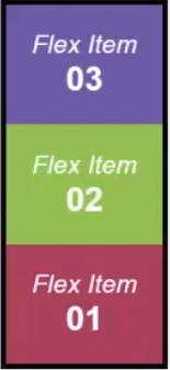
flex-direction: column; Makes the items flow vertically in the container
Flex wrap
The flex-wrap property specifies whether the flexible items should wrap or not.
Controls the wrapping of elements. De default value for the flex-wrap property is nowrap, which means that items are displayed along a line without wrapping them into multiple rows when they overflow their container.
flew-wrap: nowrap;
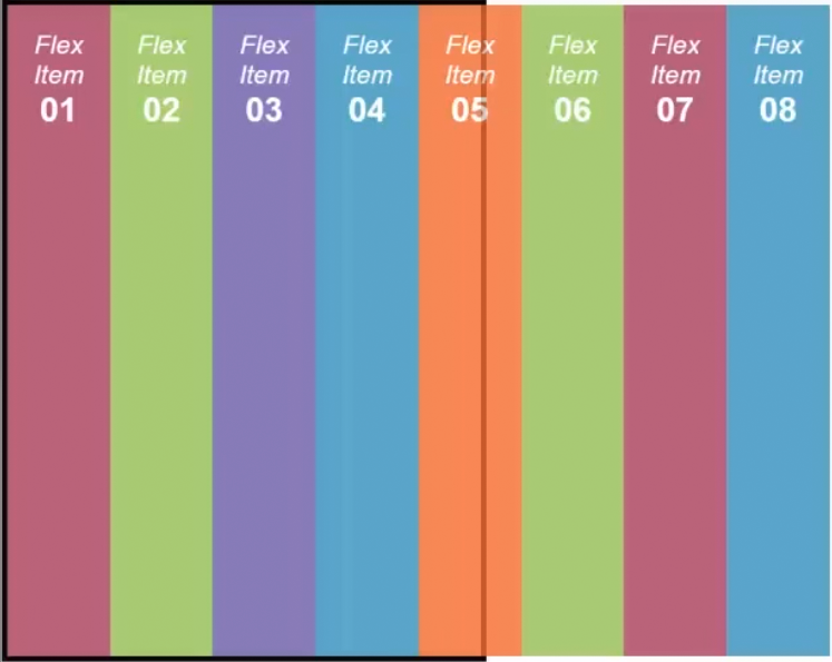
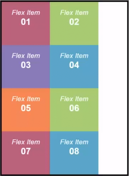
flex-wrap: wrap; // Wraps the items in rows so that they fit the container
Flex flow
The flex-flow property is a shorthand property for the following properties:
flex-flow: row wrap; // Same effect as flex-direction: row; & flex-wrap: wrap;

Flex order
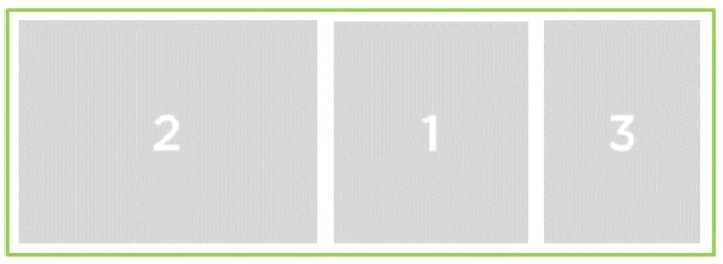
By default, the display order matching the display order in the markup. This is controlled by using the order property, which is meant to create ordinal groups. By default, all the elements inside of a flex container have the ordinal group set to 0. The property accepts both positive and negative values.
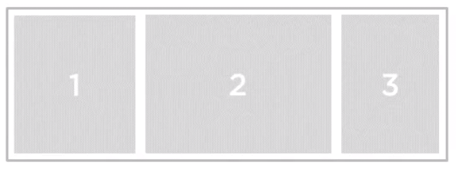
Setting order to -1 for the 2nd flex item will create the following effect:
.flex-item-2 {
   order: -1;
}
Flex grow
The flex-grow property specifies how much the item will grow relative to the rest of the flexible items inside the same container. Practically, the flex grow determines the factor of growth.
Setting flex-grow: 1 on all flex items, will make them fill up the container.

Setting flex-grow: 4 on item 2 will cause it to have a higher growth factor, and thus, be larger.
.flex-item{
   flex:1;
}
.flex-item-2 {
 flex-grow:4;
}

Flex shrink
The flex-shrink property specifies how the item will shrink relative to the rest of the flexible items inside the same container.
Setting the flex-shrink: 2 property on flex item 1, causes it to shrink (items have to have a width that makes them fill the container).
.flex-item-1{
   flex-shrink: 2;
}

.flex-items{
   flex: 1;
}

Flex basis
The flex-basis property specifies the initial length of a flexible item.
display:flex;
flex: 1 1 auto; // all in one command, flex-grow flex-shrink flex-basic
Flex alignment
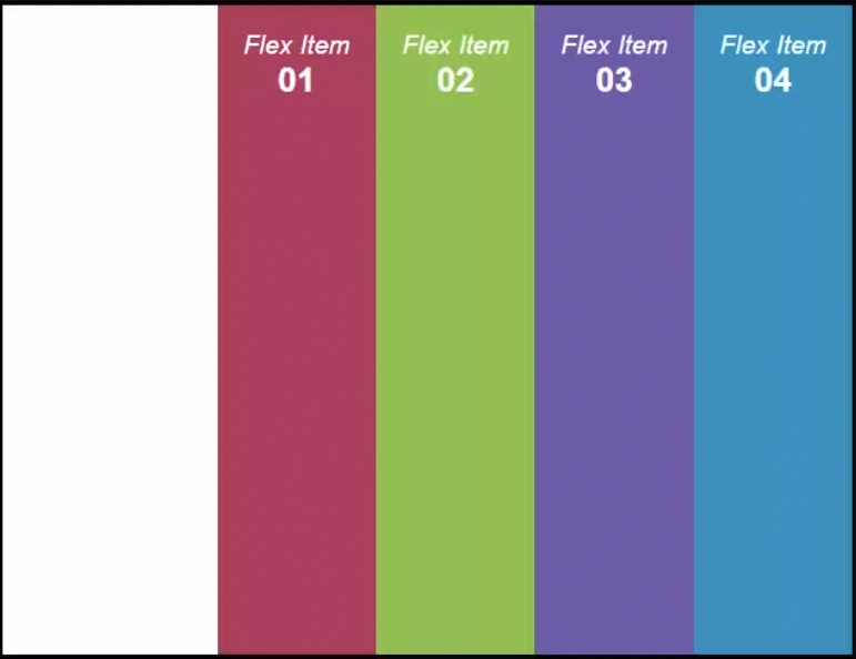
The justify-content property aligns the flexible container’s items when the items do not use all available space on the main-axis (horizontally).
Setting the justify-content: flex-end on our flex container.
.flex-container{
  display-flex;
  justify-content: flex-end;
}
The align-items property specifies the default alignment for items inside the flexible container.
Setting the align-items: flex-start on our flex container.
.flex-container {
   display:flex;
   align-items: flex-start;
}
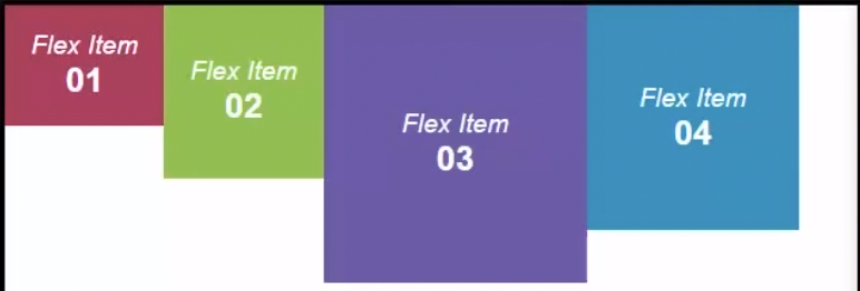
.flex-container {
   display flex;
   align-items: baseline //will align the items based on their centers.
}
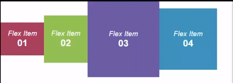
The align-self property specifies the alignment for the selected item inside the flexible container. This property overrides the align-items property.
Setting align-self on flex item 2 (on the previous example, where the container has align-items: center)
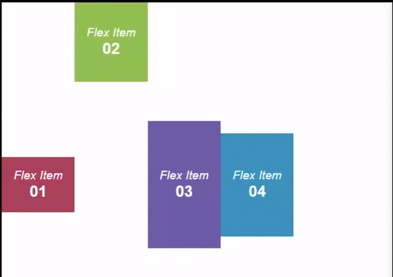
The align-content property modifies the behavior of the flex-wrap property. It is similar to align-items, but instead of aligning flex items, it aligns flex lines.
Shorthands of using flex
.flex-container {
        display: flex;
        flex-flow: row nowrap;
}

.item-1 {
        flex: 1 1 auto; /* flex-grow flex-shrink flex-basis*/
}
Grid
As of October 2017, Chrome, Safari, Firefox and Edge all support CSS Grid as a layouting technology.
What it is
While Flexbox controls how items are displayed on one dimension, grid controls how items are displayed in two dimensions (just like a grid structure. The CSS Grid Module aims to help provide a means of creating grid backed layouts.
As a concept, it’s based on de definition of a grid container that contains grid items which
are placed in rows or columns.
Declaration of a grid container
A grid container is defined by setting the display property to „grid” as explained here
display:grid; // container does not wrap it's content
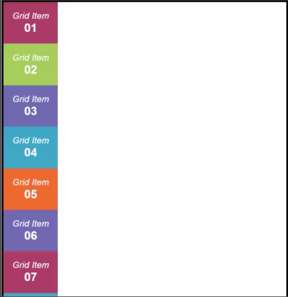
diplay: inline-grid; // Just like flexbox, creates a container that wraps it's content
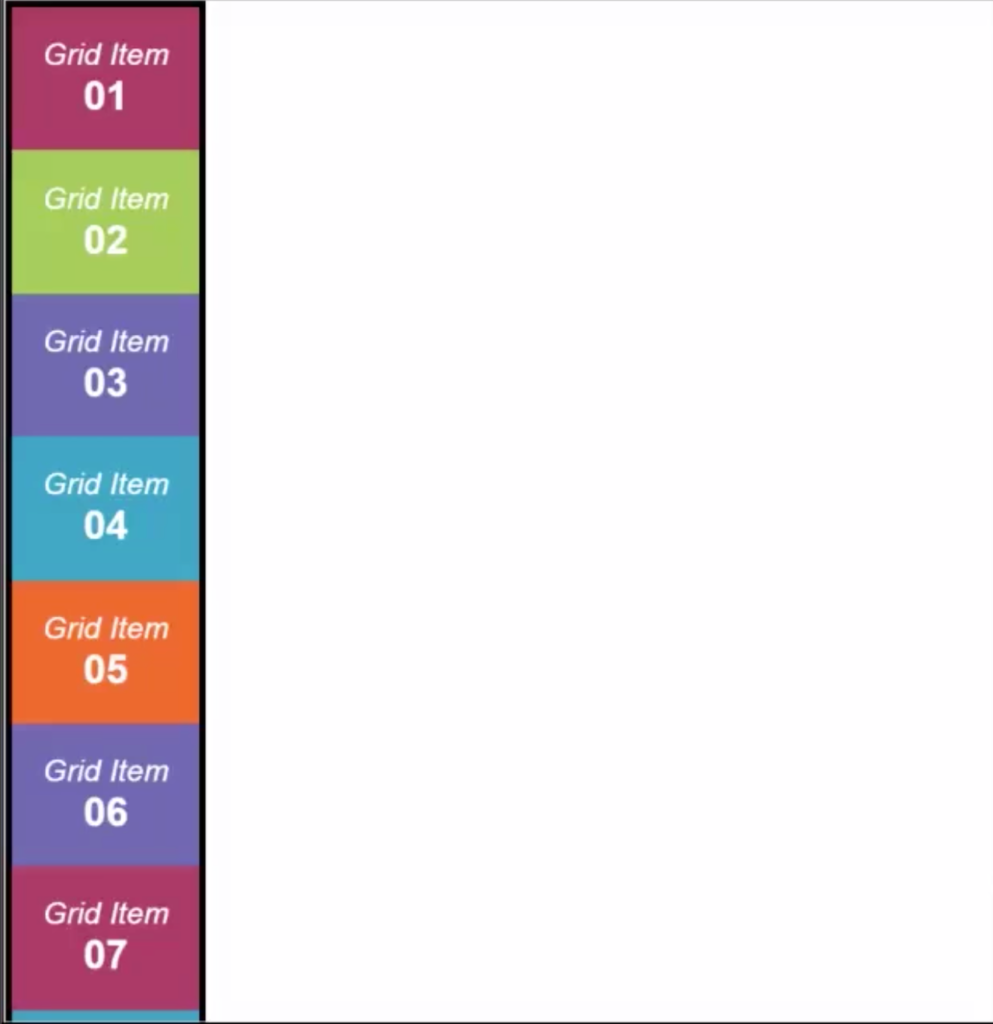
Properties
Grid columns
In css Grid, a grid template allows you to define a soft of „placeholder” applicable for both rows and column, that can be used to display elements.
The grid-template-columns property allows you to define a template for pixels.
For an existing grid container, if you set grid-column-template: 3rem 1rem 3 rem 1rem 3rem 1rem 3rem; you will get a row of elements of different widths (Think of them as placeholders).
In this example, a grid item can be placed in each of the three positions:
.grid-container{
   display:grid;
   grid-template-columns: 3rem 1rem 3rem 1rem 3rem 1rem 3rem
}

.grid-item {
   grid-column-start: 1; // will appear in the first grid position
   grid-column-end: 2 // will stretch until the 2nd position
}

When placing the grid item in the second position, as it’s „placeholder” is of just 1rem it will be slimmed down:
.grid-item{
   grid-column-start: 2; // will appear in the second grid position
   grid-column-end: 3; // will stretch until the 3rd position
}

The span of columns can be controlled by using the grid-column-start and grid-column-end properties.
.grid-item {
    grid-column-start:3
    grid-column-end: 6; // will stretch until the 3rd position
}

Grid rows
Exactly the same as columns, rows have templates that are defined by using the grid-template-rows property.
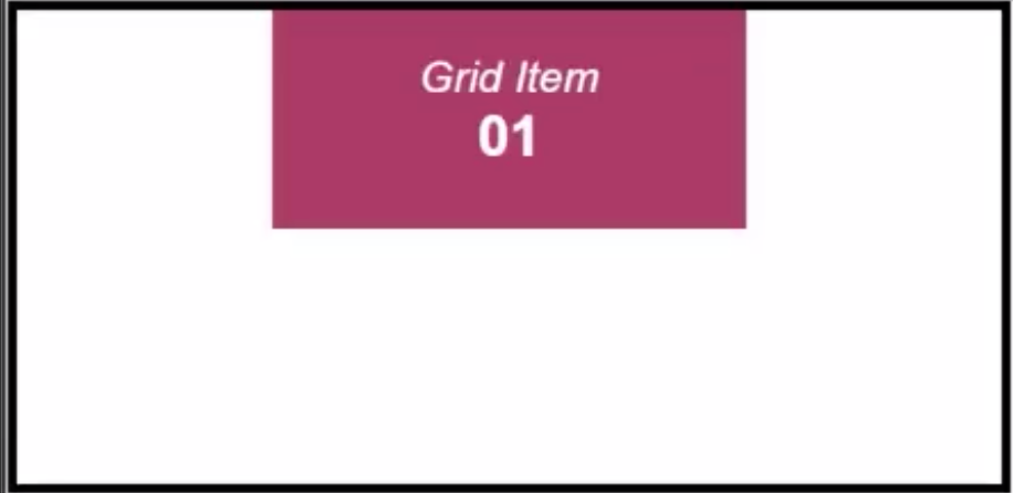
For our exact previous example, if we defined the grid container as:
.grid-container {
    display:grid;
    grid-template-columns: 3rem 1rem 3rem 1rem 3rem 1rem 3rem;
    grid-template-rows: 3rem 1rem 3rem;
}

.grid-item-1{
  grid-column-start: 3;
  grid-column-end: 6;
}
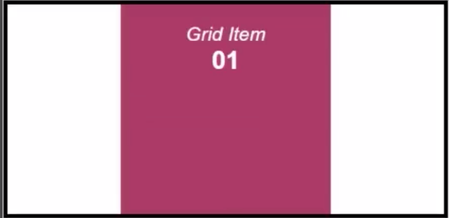
If we want to stretch the element vertically, all we have to do is add:
.grid-item {
   grid-column-start: 3;
   grid-column-end: 6;
   grid-row-start:1;
   grid-row-end: 4;
}
Grid flow
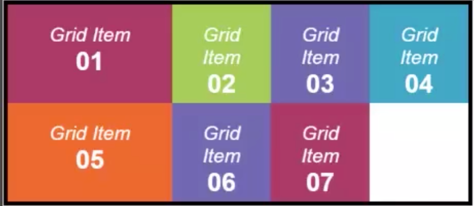
By default, a grid container has the grid-auto-flow:row; property set which means that the elements flow from left to right being displayed on the row.
.grid-container {
   display:grid;
   grid-template-columns: 6rem 3rem 3rem 3rem;
   grid-template-rows: 3rem 3rem;
   //notice the default behaviour
}
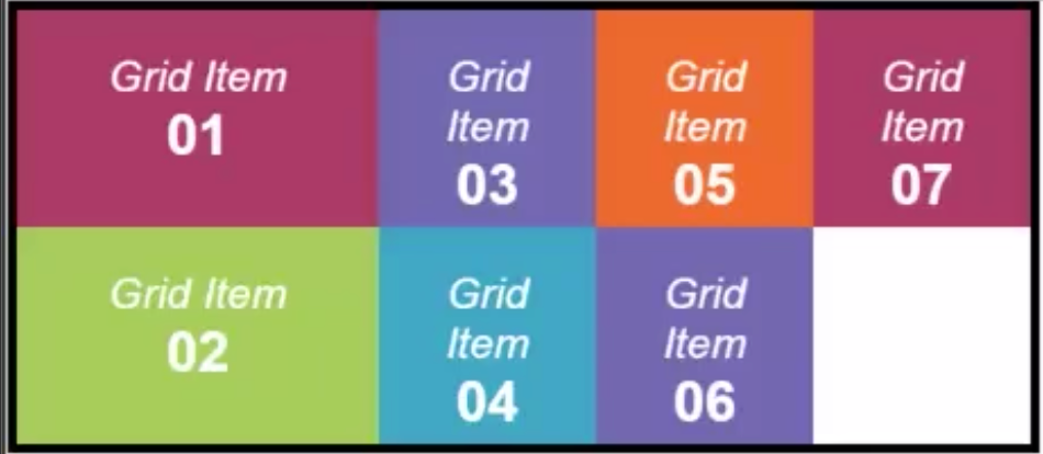
When changing the grid-auto-flow:column; property, the items will be displayed in a column;
.grid-container {
   display:grid;
   grid-template-columns: 6rem 3rem 3rem 3rem;
   grid-template-rows: 3rem 3rem;
   grid-auto-flow: column;
}
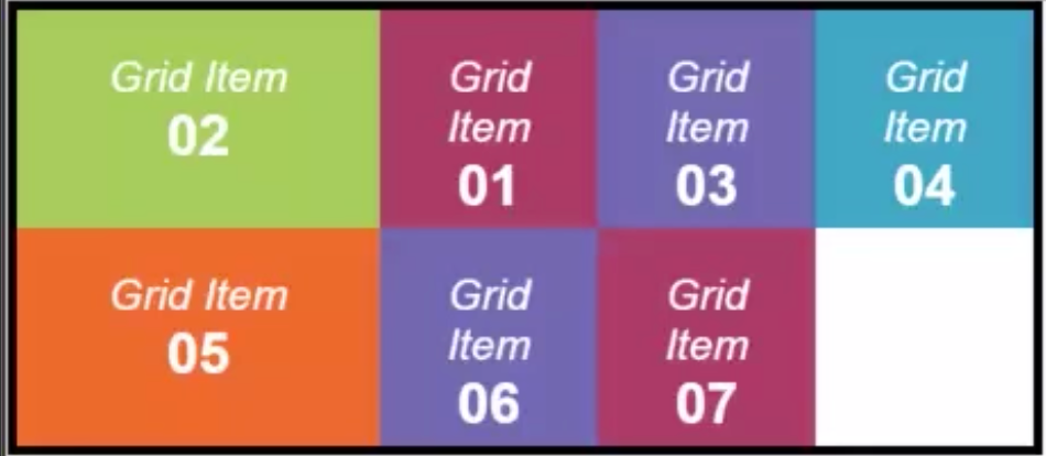
The order property, just like in Flexbox, allows for the grid items to be rearranged dynamically based on their order.
If we set order:1; on the second grid item, it will be displayed as the first element in the grid
.grid-item-2 {
     order:1;
}
Grid property
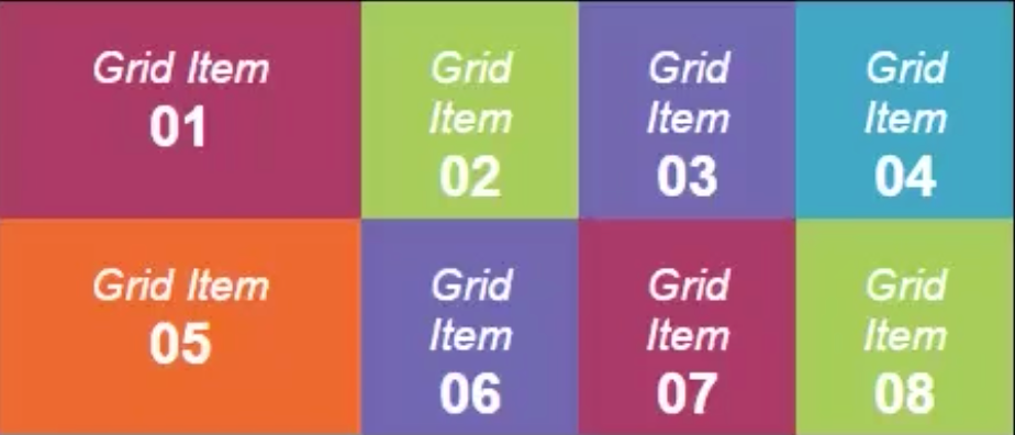
The grid property is a shorthand that allows you to setup templates for both rows and columns.
.grid-container{
     display:grid;
     grid: 6rem 3 rem 3 rem 3 rem  / 3rem 3rem;
}
Grid area property
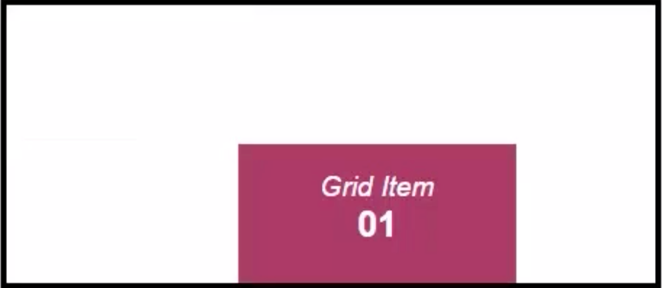
As a shorthand for replacing the need of using grid-column-start/grid-column-end and grid-row-start/grid-row-end properties for each grid item, the grid area property control the row/colom span for a grid item.
.grid-item {
    grid-area: 2 / 2 / 3 / 4
}
Named grid areas
It’s hard at times to keep track of the indexes of the grid for positioning elements. Luckily, the grid layout allows us to create naming patters for placing our content.
This can be done using the grid-template-areas property.
A holy grail layout thus becomes:
.grid-container{
   display:grid;
   grid-template-areas: "header header header"
                        "nav content aside"
                        "footer footer footer";
}
By using the grid area property we can now assign items to the grid’s named template positions:
.grid-item {
   grid-area: header; // will span this element on the header
}
Responsiveness
Viewport
A Viewport is practically the user’s visible area of a webpage. It’s like a window throughout which the user can view a website. Depending on what device he uses, the window is smaller of larger.
HTML5 introduced a method to let web designers take control over the viewport, through the <meta> tag.
<!-- Sets the viewport to respond to the device's width, with an initial zoom of 1 -->
<meta name="viewport" content="width=device-width, initial-scale=1.0">
By using this meta, we are now telling our browser to respond to viewport resizing, which enables us to create breakpoints for different resolutions.
Media Queries
Media Queries were introduced in CSS3 and allow users to apply css styles only if some conditions are true. They enabled the creation of breakpoints that would get triggered only when the viewport would reach a specific size.
// When the size of the viewport is less than 600px, the someElement
// element will be black
@media only screen and (max-width: 600px) {
  #someElement {
    background-color: black;
  }
}
This automatically enabled the ability to support all types of resolutions, for all sorts of devices.
Adaptive vs Responsive
A pretty sharp interview question is „What is the difference between adaptive websites and responsive websites?”
It’s easy:
Adaptive website change their appearance at precise points of resolution
Responsive websites shrink and grow like an elastic depending on resolutions.
This article does a great job of explaining how and why.
More advanced concepts
For advanced concepts such as how the browser processes the CSSOM or more insight about how the browser paints stuff, we strongly recommend this article.
Conclussion
If you’re on your way to a UI interview, we hope that you crush it!
Also, we hope you’ve enjoyed the article, and found it helpful at least a tad. Based on community, we plan to blossom it into the ultimate css cheatsheet.
As there is no such thing as a free meal, we kindly ask you to share the article, but only if it makes sense for you to do so.
We’re a software development company focused on building impactful software solutions, either for customers of for ourselves (we are in the process of securing funding our Bizmod project which is a business plan management solution that will blossom into an AI powered ERP.
