
I’m a big fan when it comes to collaboration and bringing together multiple roles in a team to develop new ideas and get stuff done at the end of the day. I do believe that communication makes it easier to overcome many obstacles in your life and especially at your job, where most of the time you’re dependent on others to finish what you have to do.
That’s why it’s important to know how to communicate with others and also let others know how to communicate with you.
I want us to focus on Storybook today. A tool that helped me, as a front-end developer, to communicate better with the designers team and developed a source of truth of what our implemented design system is capable of.
This article is mainly dedicated to:
- Front-end Engineers: People who want to embrace a component-driven development methodology and enhance their work efficiency in the long run.
- Designers: Individuals seeking to establish consistent and cohesive designs throughout the entire app.
- Technical Leads: Striving to optimize processes and achieve maximum efficiency in their teams.
Storybook
According to ChatGPT:
Storybook is a popular tool used in frontend development to help build and document user interface (UI) components in isolation.
Documentation – the last thing that we need… WE WANT FEATURES!
Before closing this blog, I want you to do an imagination exercise.
Imagine the last time you’ve been in a meeting and a feature is presented to you. When the design finally comes up, you will feel that your implemented design system is completely off and it will take a long time to refactor many of your reusable components (hopefully you have something like this).
I’m pretty sure you can resonate with it.
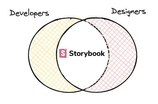
This is happening because most of the time the frontend team and the designers go in parallel and, in many teams, they rarely intersect.The frontend team is busy building features and the UI team is building the design system and when both of the teams arrive at the end of the road, they see completely different implementations.This reason of is the missing of a common ground. Developers spend a lot of time in the code. VS Code, Vim or Webstorm is their realm. Designers have another world – Figma or AdobeXD. We are solving two different problems here.
Finished with the imaginary exercise. If you’re still with me, let’s dive into preparing your project in no time and exploring the features that Storybook provides.
As a note, this article is made for working with Angular Framework. For other frameworks, it should be a similar setup but double-check their documentation.
Setup
The great thing about Storybook is that it has the same setup no matter what framework you are coming from.
If you don’t have a project, generate one by using:

Next, generate the storybook:

And that’s it! Let’s explore the files generated:
- storybook
- main.ts
- preview.ts
- tsconfig.json
- typings.d.ts
- src
- stories // This is just for showcase purpose, you can delete it
- main.ts
In this file, you can change how to detect stories, framework options and add-ons. This provides useful if you have for example different styling formats or if you want to add extensions. - preview.ts
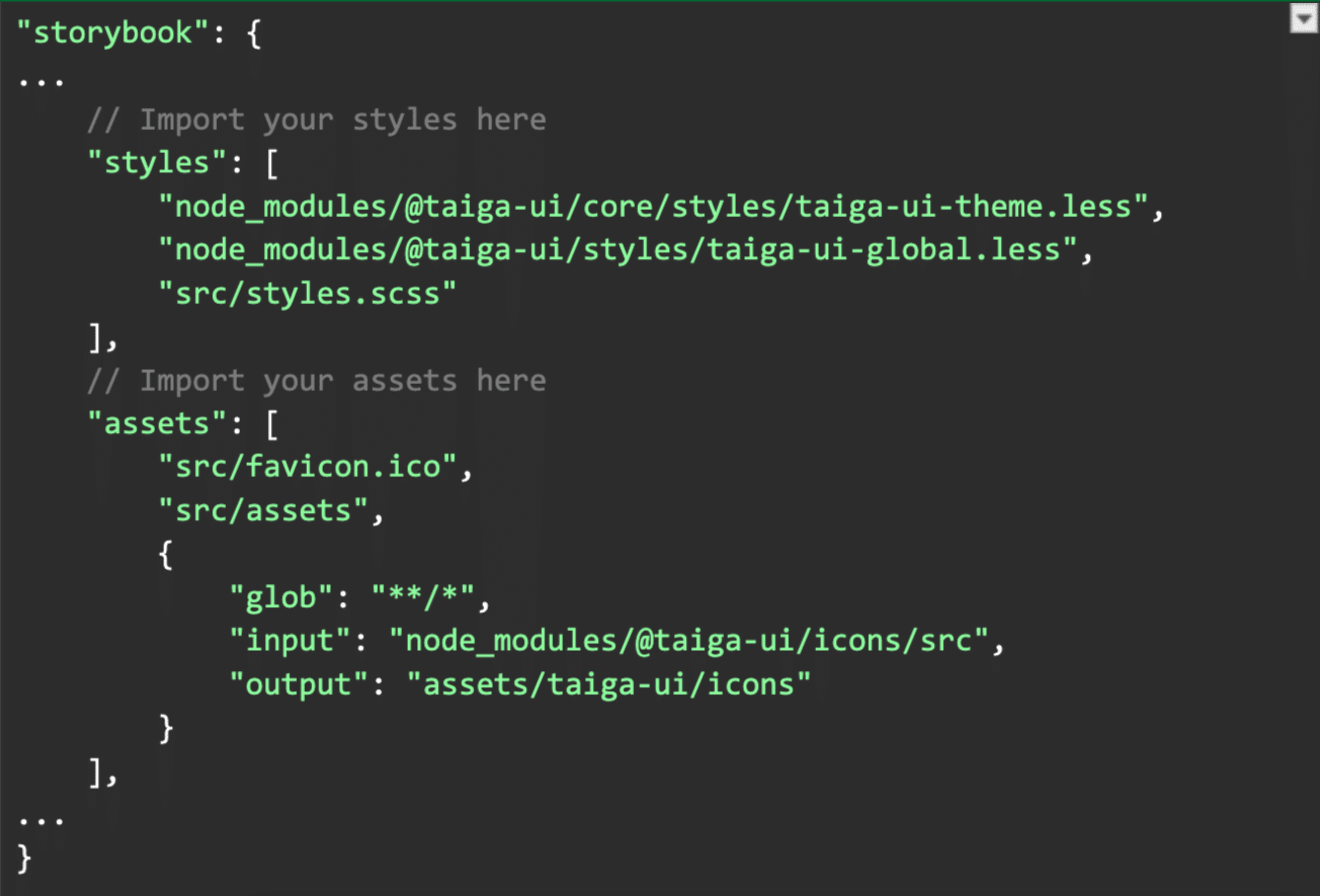
To import the global styles of your app inside of Storybook, you have to import them here as well.
Also, you can add changes to how the Storybook looks like itself, to respect your company design system.
For Angular, there’s a caveat. From Angular 13 upwards, you will have to import them into your angular.json. You will have a new entry in your architect object called storybook.
As a rule of thumb, everything that you have imported under build you will have to import under storybook as well.
Below you have an example for importing Taiga-UI styles, an UI components library. Is not relevant for this project but I want you to have an example of how you can do it
- tsconfig.json and typings.d.ts
Comes out of the box with Typescript. They contain the compiler options and in typings.d.ts you can declare the types that you want to use throughout Storybook stories
Congrats! You’ve completed the setup! You start the Storybook with:

Let’s dive into the creation of stories!
Stories
A story is the basic unit of what Storybook is all about. Through them, you can render components in isolation and you can change their parameters on the go.
This gives you great power during development because of two reasons:
- Develop in isolation
Your component is not affected by other stylings of the app. This is great when you’re developing atomic components and you want to check the look and feel. - Hot module reload
You don’t need to rebuild your app to see the changes. This goes for both the stories and components.
Let’s take a look at a component, together with their story.
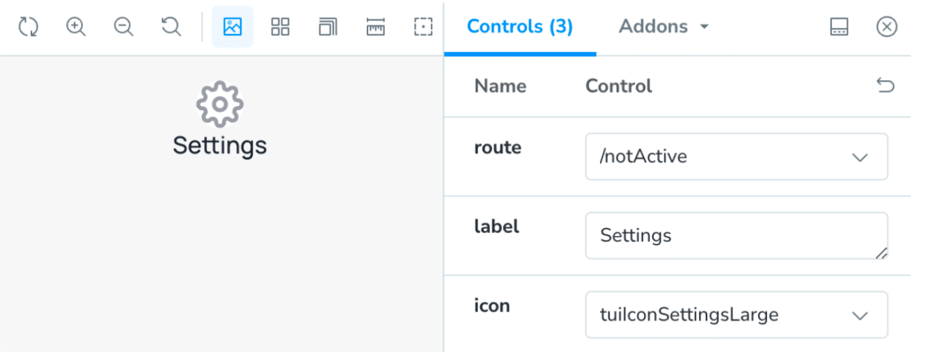
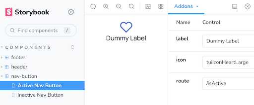
I’m having a navigation button that supports as input a label, a route and an icon.
It looks something like this:

With Storybook, I have the chance to expose all the behavior of this component in an isolated manner. I can change all the inputs required.
In this way, the designer can understand how a component is implemented and what can be changed.
How do I implement such a thing? Let’s take an example and explore it a bit.
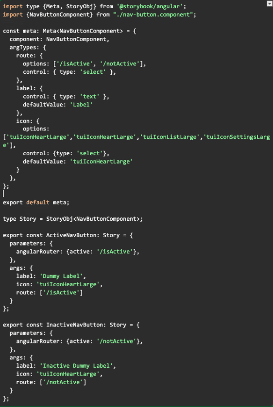
The meta const defines what component is going to be rendered and what are arguments the component accepts.
After you’re declaring the meta, you can create multiple stories of the same component. In this case, we’ve created two stories. One for the activated nav button and the other for the inactive one.
Now, let’s scale. Imagine you have a design system in place. You follow Component Driven Development. You expose all the atoms, molecules and organisms that are implemented to the designers.
This is just a small subset of features that Storybook can provide. Besides developing, you can also test in isolation.You can do visual regression where you test from your PR version and test it against the main branch.
The bridge
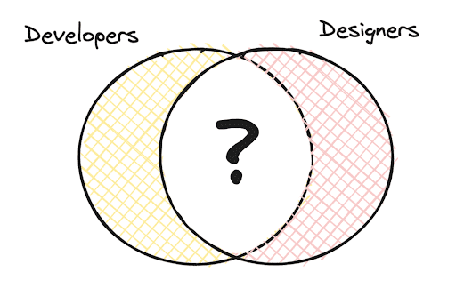
Remember the diagram of the intersection between developers and UI? Storybook will fill that in.
There are some requirements to build this bridge from both camps.
Development team requirements
- Component-driven development – Developers need to learn to follow component-driven development when building the components. I believe that this approach is mandatory but I do understand that sometimes when you’re developing an MVP or a very small application you might not follow this approach.
On the other hand, if you’re working with an enterprise-level application, that’s the only way to scale and develop a predictable and uniform UI. - Building Storybook – As you’ve seen, there is some code required to do that. With each line of code, there’s a maintainability cost that is coming with it.
The way I’ve seen the approach working well is by having stories as part of the requirement.
As you have unit tests, integration tests and e2e tests, the same you should have stories for your atoms and molecules.
Designers team requirements
- Component-driven development – The same as in development, the component-driven approach is a must. In this way, developers and the designers team will have the same language and references.
- Building with components in mind – Before developing a feature, check with Storybook what are the capabilities of the existing components. If there are missing features, update the atoms and molecules first.
Conclusions
As you can see, the bridge is a process at the end of the day. It comes as a solution to mismatching UI development and flanky designs by finding a common ground between developers and UI team.
This is just a small piece of what Storybook can provide for you and your development experience.
I encourage you and your team to give it a try especially if you work with enterprise level applications.
By implementing this process, you will experience the following benefits:
- Improved Communication: Teams will find it easier to collaborate and share ideas, leading to better overall coordination and understanding.
- Better Development Experience: Embracing a component-driven approach with building blocks will streamline the development process, resulting in a smoother and more efficient workflow.
- Identify changes faster: Identifying necessary changes will be easier and faster, especially during the tech specs creation phase. You can quickly spot what’s new and what already exists.
Time Savings with DRY Principle: You’ll avoid redundant work and create reusable components and functionalities, ultimately saving time in the long run.

